
The Power Of UI
User Interface (UI), not to be confused with User Experience (UX), though both are vital to website usability, is one…
Patience might be a virtue however the majority of web users are in a hurry. It has been reported that 53% of visitors using a mobile browser to view a site will leave if the page takes more than 3 seconds to load. With an increasing majority of internet use taking place on a mobile device, it definitely pays to be speedy! So how can you ensure your website is keeping up?
Imagery is key to the vast majority of websites, but all those great visuals can really slow a website down. Ensuring that you are using a responsive website template is the ideal first step to ensure mobile web users are getting the best experience of your site. It is worth noting that a responsive template alone may not be enough to achieve the quick page download speeds you want. While some factors, such as 3G and 4G connection speeds, are outside of your control, one effective way to streamline your page loading speeds is to ensure your images are optimised. The size of an image file will directly affect the download speed of the page.
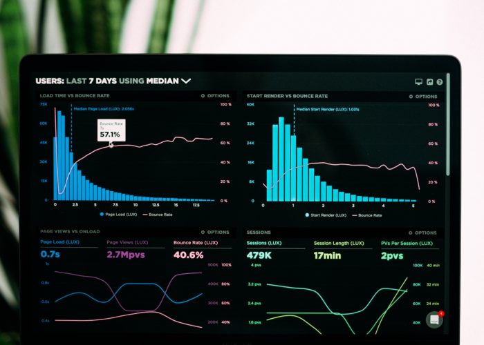
Using a tool such as Google’s Page Speed Insights can help to pinpoint what and where site images can be scaled, though this will require a little more focus when using a responsive site.
One solution is Picture Element, allowing you to create multiple files of varying dimensions for the same image. Picture Element will then serve visitors the image size best suited to their screen. Mobile users will subsequently be using less data to download and view a page, providing a swift, seamless User Experience.
Thoughtful resizes of image files can also go a long way to improving page download speeds.
There are a number of options for resizing an image file, reducing the size of the file by removing non-essential data without losing any visible image quality. Depending on the purpose of the image, more drastic resizes are also possible though you will have to evaluate if a further loss of image quality is worth the improved page performance. Some tools that can help you compress your images are ImageOptim and Compression.io
Taking a more ruthless approach, is it sometimes worth evaluating if all images are even required on a mobile page? What may be a strong design when viewed on a desktop, could be surplus to requirements when viewed on a drastically smaller screen. Again, this is where a responsive website could be eliminating some of the work for you by automatically hiding some images from mobile devices and browsers under a certain width. It’s important to ensure that the image files are not still downloading, even if they’re not visible, to ensure the page is performing fast enough and not using up unnecessary data.
Here at We Are Hex we pride ourselves on providing well-designed and thoughtful built websites. Get in touch to talk us through your next project.
User Interface (UI), not to be confused with User Experience (UX), though both are vital to website usability, is one…
When it comes to design, specifically web design, it can be difficult to decide what success looks like. The best…

The internet is a crowded market place and half the battle is ensuring your target customers can find your eCommerce…