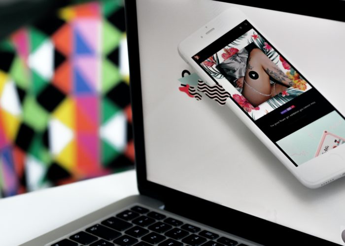
The Power Of UI
User Interface (UI), not to be confused with User Experience (UX), though both are vital to website usability, is one…
User Interface (UI), not to be confused with User Experience (UX), though both are vital to website usability, is one of the most powerful tools at your disposal. Bad UI can turn off potential users to your website or app within just a few short moments. Great UI will help to ensure visitors stay engaged with your content and ultimately become converted into customers or service users. Great UI design will bring the visual identity of your project together, ensuring the project looks great whilst also meeting the functionality requirements of the brief. So how can you make sure your UI is doing the job? Here are some key areas to think about when planning for efficient design.
It’s all well and good using splashing the latest hand brushed font across your banners but is it legible? UI is all about ensuring the visitor is having an easy and efficient experience and can access the information they want quickly. A clear, easy to read font is a simple way to ensure that visitors are seeing the information you need them to. (Remember that aesthetics are equally important, so avoid Comic Sans at all costs!)
Colour is a huge part of visual communication so you need to ensure that any colour scheme well thought out. COlour can convey personality, mood and tone. It evokes emotional responses and reactions from visitors, sometimes without them even realising, so it pays to be mindful of how and where you use colour. Eg; Green usually is synonymous with ‘Go’, or ‘Pay’ buttons, while red usually suggests ‘Cancel’ or ‘Stop’. What colours are going to speed up or indeed slow down, a visitors decision making whilst navigating your site?
Don’t over complicate things. Too many fonts and confusing layouts can put visitors off before they’ve successfully found a product or service. Choose a small group of complementary fonts and stick with them throughout your different site pages. This not only helps reinforce brand identity but will help visitors to quickly familiarise themselves with your site as they navigate. This rule applies for layouts too. Elements that appear across multiple pages should ideally be placed in the same area each time to ensure easy navigation.
What information is most important to users? What will they be visiting your site to find?
Ensure key information has priority placement throughout your site so visitors can find and access it with ease. Less vital information can then be placed accordingly.
Implementing a grid system is useful here and can help you to prioritise and design user interface ensuring important sections are connected and flow easily despite being separate pages or elements. If you’re interested in further information using a grid system to plan effective UI design see our previous post. We hope this post has offered some useful insights. Why not get in touch with the team to discuss the UI requirements of your next website?
User Interface (UI), not to be confused with User Experience (UX), though both are vital to website usability, is one…
When it comes to design, specifically web design, it can be difficult to decide what success looks like. The best…

The internet is a crowded market place and half the battle is ensuring your target customers can find your eCommerce…