
The Power Of UI
User Interface (UI), not to be confused with User Experience (UX), though both are vital to website usability, is one…
It is 2018. Yes, we all still use laptops and computers but we have to admit…we spend most of our time on our mobiles. They are easier to manage and to transport. You can access millions of apps and use the internet in your hand. Laptops, on the other hand, are better to keep at home or in your place of work.
If this article was written twenty years ago, you have laughed at me as no one used phones for the internet but for phone calls and texting. It wasn’t until the late 90’s that we could use the internet on our mobile devices. The Nokia 9000 Communicator was a smartphone before the word was invented. It had web browsing and emailing abilities. In 2010 when smartphones became very popular, and many people could get hold of one, the popularity of internet browsing increased dramatically. Now in 2018, we use our mobiles to search on the go. It takes seconds to pick up our phone and search what we need to search. It is highly likely that your website will be viewed on a mobile than a laptop.
The majority of us are guilty to have an obsession over our little mobile device, even if we don’t want to admit it. If someone views your website on their device, you want it to be viewed with ease. If not set-up correctly, when viewing on a mobile, the layout could collapse and look unprofessional. It is important for your website to automatically snap into a narrower fixed structure without items overlapping and text being hidden.
In 2016, the number of mobile and tablet users overtook the number of desktop users across the world. This stresses the importance of having a responsive, clearly set out website that works on any sized screen and enables your target audience to have an enjoyable browsing experience.
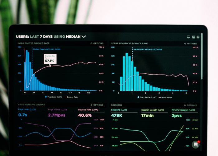
To track and monitor your mobile traffic, you can use Google Analytics. Below is a step-by-step guide on how to do this which includes tablet traffic:
There are many ways to configure these reports. These could include advertising, social or conversion metrics.
Having a mobile-friendly website brings several key advantages along with it. These include:
From 21st April 2015, Google started giving preference to mobile-optimized sites in mobile search results. If even a small amount of your target audience are on mobile devices, this could make a massive difference on your online visibility. In a nutshell, the better the experience provided for your mobile visitors, the more likely they are to engage and purchase something.
It is impossible to see when your target visitor will arrive on your site, so it is incredibly important that your website is ready to work on any device they may be using, wherever they may be. If your website does not scale down to the correct size of their device it will make your overall brand look unprofessional and your target audience will leave your website without being properly viewed.
On the whole, you will be able to tell whether your website is mobile-friendly. You will be able to tell as if it scales down to display content and navigation in a way that is usable and user-friendly on smaller screens then it is ok. It’s ok not to be sure though! Google offers a ‘Mobile-Friendly Test’ that makes it easy to check. To do this, you need to enter your website URL and it will tell you whether or not your site fails or passes the test. If it passes – fabulous; if it fails you should look into converting your site to a mobile-friendly format sooner rather than later.
Thank you for reading this article. Remember, it really helps to make your website user friendly!
User Interface (UI), not to be confused with User Experience (UX), though both are vital to website usability, is one…
When it comes to design, specifically web design, it can be difficult to decide what success looks like. The best…

The internet is a crowded market place and half the battle is ensuring your target customers can find your eCommerce…